Never underestimate the power of a statement room. We know that a first impression is made within seconds, and while our focus may generally be fixed upon making a great first impression through dialogue and body language, are we forgetting those scenarios where we aren’t given the chance to use those forms of communication? What about walk-bys, where judgements are cast on your facilities before your staff have an opportunity to greet them? Or those prospective clients that do research based purely on business’ Instagram feeds or tagged photos?
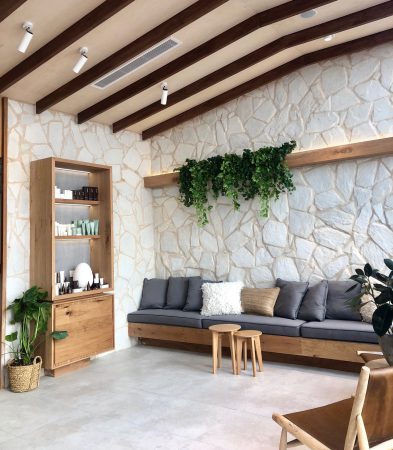
Aside from these, walking into a killer reception space can often be a make or break moment for new clients, no matter how good your service is. Let’s face it, some clients are simply ‘visual people’ and the right environment can be the deciding factor. This is where injecting personality, passion, your brand story, and a few knock-out pieces of furniture can really come into play.
If ever there were a spa industry expert when it comes to jaw dropping spaces, it would have to be endota’s resident architect Caitlin Marshall – and those of you who have seen the endota head office or new wellness colleges would agree.
“Our reason for existence is to help women be their best,” says Caitlin. “This purpose is at the heart of everything we do in our spas and permeates through to the people behind the brand.”
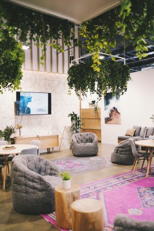
According to Caitlin, when creating a statement reception space, you should consider both how you want clients to feel upon entering, and how to inject your brand heritage at the same time.
“The aim for our reception areas is for visitors to walk in and automatically give the ability to feel at home, relaxed and in a safe place where they will be taken care of,” says Caitlin. “The design very much links back to our company’s heritage and the inspiration behind the brand. endota was born on the Mornington Peninsula, so we’ve kept the area very light, bright and using organic textures and colours which transport you to a place where you can feel cared for.”
“Our signature feature is an indoor swing which is symbolic of our philosophy for work. Located on the Mornington Peninsula, surrounded by lush green farms; the endota Support Centre challenges the traditional workplace landscape.
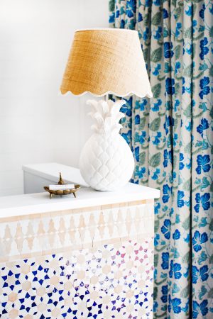
Gold Coast enthusiasts may be familiar with the recently-opened Halcyon House; whose bold and bright, Hamptons-style day spa is anything but ordinary.
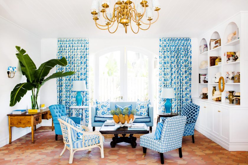
“The spa reception and boutique is an eclectic mix of upholstered seating, bright blue-and-green Hibiscus printed curtains from Anna Spiro Textiles, arched bookcases and terracotta tiles from Mexico, says Halcyon Spa’s manager, Alessandra Viel. “The reception counter features a stunning design of Moroccan mosaic tiles. Anna Spiro is the brains behind the aesthetic and she based the Spa’s colour palette on the beach and the ocean, with the use of sandy beige, pale shell pink, seafoam, turquoise and deep blues.”
As with endota, Halcyon draws on its natural environment – in this case tropical seaside surroundings, to create a luxurious, beach getaway vibe to ensure ultimate relaxation.
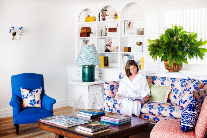
“We want our clients to feel relaxed, inspired and most of all – comfortable,” says Alessandra. “Guests absolutely love the Spa space and are really drawn to the colour palette throughout. The textiles are frequently complimented as are the Mexican terracotta tiles and colour themed treatment rooms.”
Another example of strong branding leading to a breath-taking space is Vaia Beauty in Darlinghurst; who according Therapist Siobhan, takes its inspiration from Japanese spas.
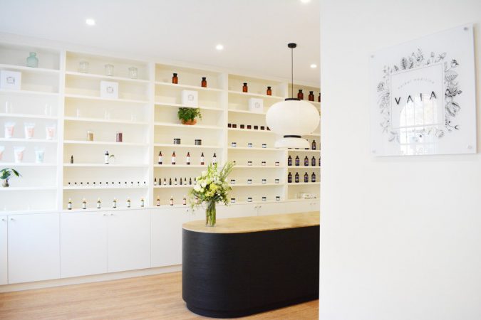
“I wanted the salon to feel simple, contemporary, warm and inviting,” says Siobhan. “The materiality is understated and earthy (timber and beige) however we needed a key element which would really bring everything together. The reception desk is a long, curved counter and it is made from a black timber veneer which has been curved so that there are no sharp corners. We really wanted this piece to be strong yet soft at the same time, and by combining striking materials such as the black veneer and natural marble top with the curved corners I feel we have achieved that. The pendant light hanging above the counter was chosen to compliment this aesthetic. It has a very Japanese vibe as it is reminiscent of a Japanese paper lantern.
Siobhan says the finishes and materials all come together to create an overwhelmingly relaxed, Zen impact.
“Warm timber finishes, neutral coloured honed marble benchtops and gentle beiges create a soft and Zen-like sanctuary. The aim is for our clients to instantly feel relaxed, refreshed and revitalised upon entering the space. Our clinic has a sense of certainty about it when you walk in; this is important for clients to feel like they are in safe and trustworthy hands.”
“Everyone who enters Vaia Beauty experiences the wow effect- even our delivery drivers. The exotic fragrances burnt in reception lure people to walk in; this is Vaia’s custom blend of essential oils of course! Vaia Beauty is a light filled oasis referred to by our clients as a sanctuary.”

