Do you pay close attention to the colours used on your feed?
We know that colours matter. They have the ability to trigger certain psychological reactions, and can be used to influence the moods and emotions of visitors to your business in positive ways – the same way that many hospitals utilise greens and blues throughout their designs and uniforms to calm their patients and guests.
In the same way, the colours you incorporate throughout your business are used to ‘set the tone’ you want to create, invoke certain feelings relating to your brand values, and tell visitors a bit about who you are – and these colours serve this purpose throughout each client interaction, whether it be physically setting foot in your store, or simply looking at your website or brochures. This also applies to your social media.
To give you some food for thought, here are some questions we would recommend asking yourself when it comes to your branding, colours and social channels:
- Do you have a selection of specific colours you incorporate into your business? Have you recorded these on a chart, mood board or the like?
- Do you choose images for your Instagram based on their colours or temperature?
- Do you regularly view your own Instagram grid to ensure that your colour scheme is reflected at large, and images don’t clash with one another?
- Do you know what your business’ colour choices say about you? Can you confidently describe why you have chosen the colours you have?
Establishing a specific colour chart or scheme and sticking to these colours throughout all facets of your business is an important component of your branding. When prospective clients find your profile on Instagram, it’s likely that the first thing they will do is click through to your grid, viewing all posts at large to get a general sense of who you are before they begin clicking each individually. If you have a strong and consistent colour scheme and ‘feel’ to your images, as opposed to a mish-mash of colours and styles, you will have a much stronger impact on your viewer, and clearer communication of your personality as a business.
If you’ve never really thought about your colour selection before, perhaps you could consider the messages, moods and emotions that are conveyed through each, and incorporate certain ones throughout; according to your own unique brand values. Here’s what colour psychology tells us about the feelings conveyed by certain colours:
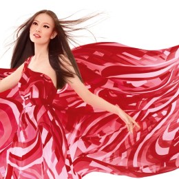
Red: Stronger emotions – power, impact, love, energy, strength. Of course there is the other side to red, which can signal danger and warning (ie. stop signs) so be selective. Great for lively salons with bold confident personalities.
Blue: calm, healing, respectful, dependable, trusting. Ideal for medispas or holistic brands.
Green: harmony, balance, rest, natural, tranquil. Unsurprisingly the perfect day spa colour.
Yellow: joyful, cheery, warm, friendly, youthful, optimistic. May be appropriate for youthful fun skin clinics with a lighter edge.
Pink: feminine, flirty, gentle, innocent, playful, sensitive, loving. A great colour for clinics with a friendly but soft nurturing soul.
White: sophisticated, elegant, luxurious, clean, calm, exclusive, pure, simple. It’s no wonder we see so many white minimalistic clinics and aesthetic practices!